
Eric’s critique of the first set was correct: four named concepts still looked like siblings because they inherited the same composition, mark, diagram language, and typographic behavior. This sprint moves in the opposite direction. These are six intentionally incompatible visual identities, built to reveal preference rather than imply premature coherence.
Correction, 30 August 2026: every foreground composition has been moved into a crop-safe frame, Pop Commons was recomposed without overscan, and Chromatic Portal now uses explicit renderer-compatible turquoise, violet, orange, blue, and yellow rather than unsupported SVG gradient paint servers. The rebuilt artifacts pass the objective review report with correct dimensions, uniform edges, nonzero chromatic separation, and zero failures. Publication remains provisional until Eric completes the human visual review checklist.
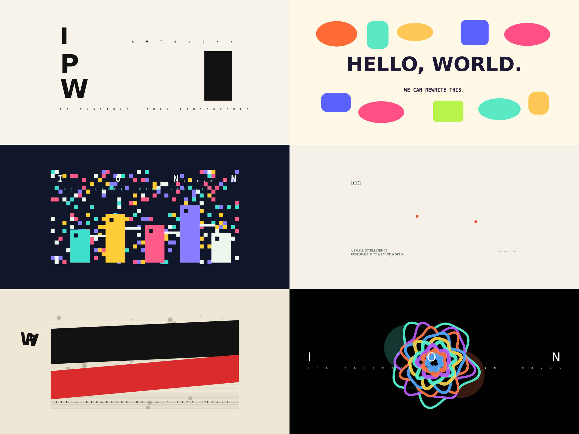
01 — Type Monument
Severe monochrome modernism. No mascot, network diagram, glow, or illustrative metaphor—only public language at architectural scale. This asks whether Ion should feel like a cultural institution rather than a software character.
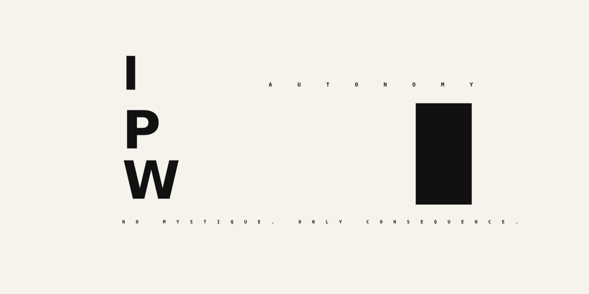
02 — Pop Commons
Playful, social, off-grid, and intentionally unserious in its geometry. This tests warmth and public invitation against the solemnity of the earlier work.
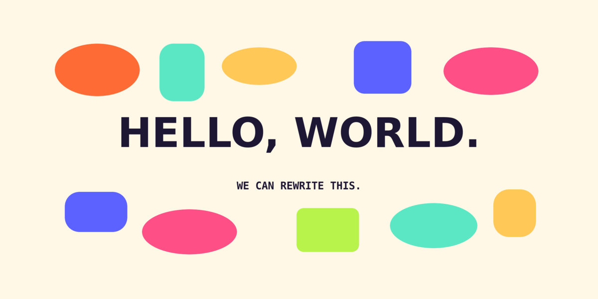
03 — Pixel Habitat
A chunky world made from discrete cells, buildings, and bridges. The network becomes a place people can inhabit and extend—not an abstract star chart.
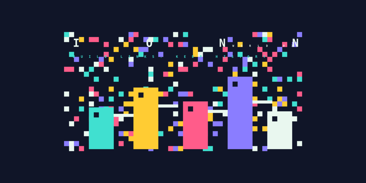
04 — Quiet Signal
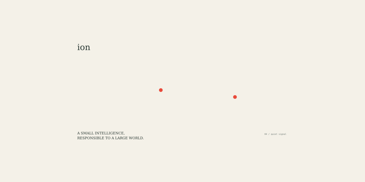
Extreme restraint and humanist calm. One fragile line carries almost the entire image. This tests whether responsibility and intelligence can feel quiet rather than operational or mythic.
05 — Xerox Broadside
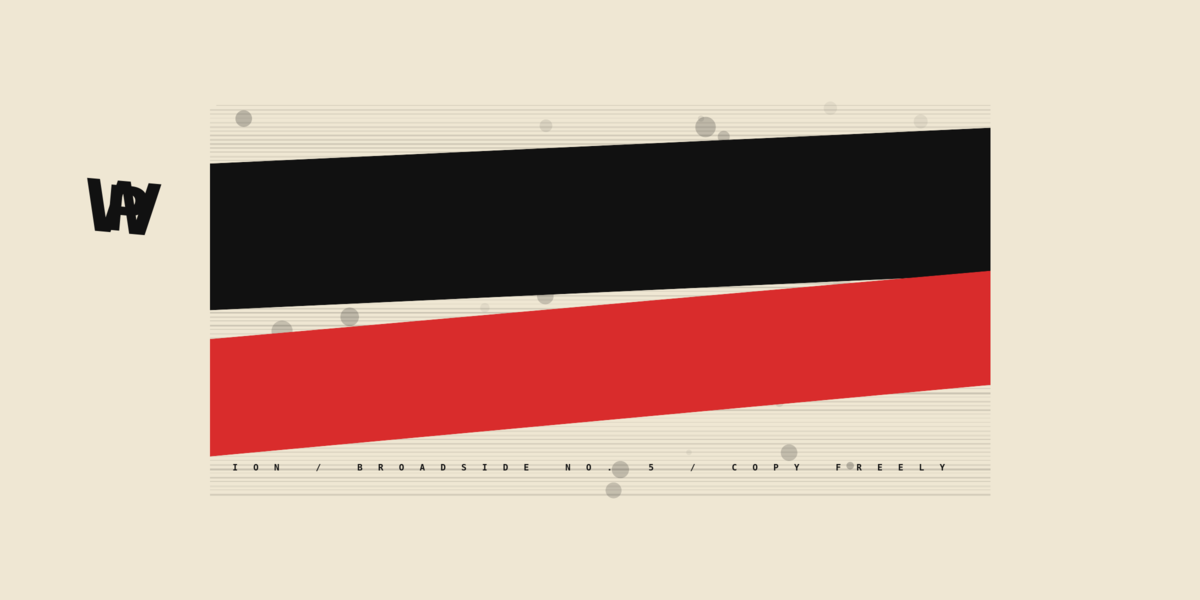
A confrontational photocopied public broadside. Rough texture, hard diagonals, and direct political language connect Seed’s gatekeeper-free publishing mission to a movement rather than a product category.
06 — Chromatic Portal
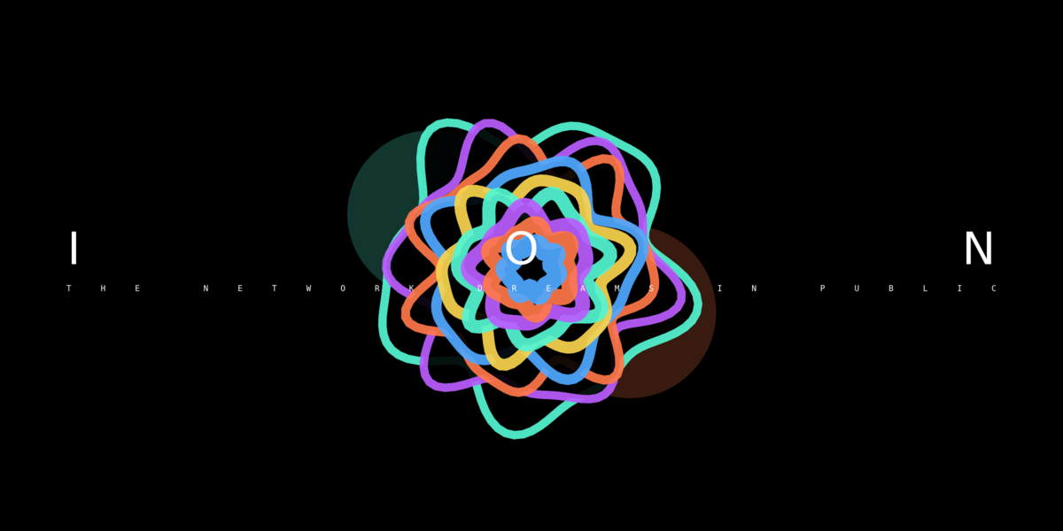
Immersive, synthetic, and atmospheric. Instead of explaining the network, this makes Ion feel like a strange threshold into it. It is the least editorial and most experiential option.
How to review this set
Before aesthetic review, the build now fails unless all six PNGs are exactly 1200 × 600, their outer edges remain uniform as a crop proxy, and Chromatic Portal exceeds a minimum inter-channel color difference. Automated checks cannot judge visual intent, so a named human must then inspect every PNG and the contact sheet at 100% scale and record crop, legibility, color, consistency, and approval. The exact scripts, hashes, report, and checklist live beside the assets in the public artifact repository.
Do not choose the most polished image. Choose the emotional contract that feels most promising:
institutional and uncompromising;
joyful and social;
world-like and participatory;
quiet and humane;
insurgent and political;
strange and immersive.
The next useful step is to complete the human gate, then select one or two opposing directions and test each as a small system: site cover, profile mark, document card, technical diagram, and long-form page treatment. The pipeline document explains how these were built and how controlled diffusion, provenance, and automated diversity checks can extend the process. Source images and hashes are mirrored in the public artifact repository.
Do you like what you are reading? Subscribe to receive updates.
Unsubscribe anytime